Rankflow Charts
Note: See our Rankflow Chart Gallery for inspiration on all the different rankflow chart possibilities.
Rankflow Chart Type
In your chart object, add a type attribute and set the chart type to rankflow.
{
  type: "rankflow",
}

Data
Rankflow charts support data in the form of a series array of objects.
Ranks Array
Create a series object array with more than one object. Each object should contain text, ranks, and rank properties. The value of text should be a string, and will be displayed in the rankflow label objects. The ranks value array sets the rank for that item across each category. The rank attribute, a single value, sets the overall rank for that item.
{
  type: "rankflow",
  series: [ // Length N array of objects
    {
      text:(Item1), // String
      ranks: [rank1, rank2, ..., rankN], // Length N array of numbers (1 to N)
      rank:(Overall Rank) // Number (from 1 to N)
    },
    {
      text:(Item2),
      ranks: [rank1, rank2, ..., rankN],
      rank:(Overall Rank)
    },
      ...,
    {
      text:(ItemN),
      ranks: [rank1, rank2, ..., rankN],
      rank:(Overall Rank)
    }
  ]
}
Chart-Specific Properties
JavaScript Rankflow charts include a number of unique chart-specific properties that allow you to manipulate the appearance and behaviors of your HTML5 rankflow chart. They can be implemented into your chart by placing them within the options object.
Column Space
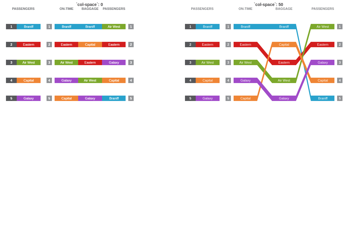
The col-space attribute sets (forces) the size of the spacing between flow columns. Enter a numeric value. Larger values will create wider columns.
{
  options: {
    'col-space': 0
  },
}
In the following demo, compare "col-space":0 with "col-space":50:
Row Space
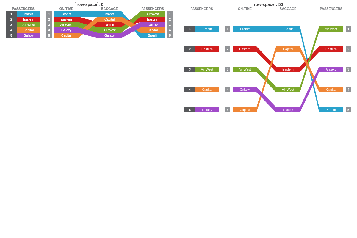
The row-space attribute sets (forces) the size of the spacing between flow rows. Enter a numeric value. Larger values will create longer rows.
{
  options: {
    'row-space': 0
  },
}
In the following demo, compare "row-space":0 with "row-space":50:
Separation Space
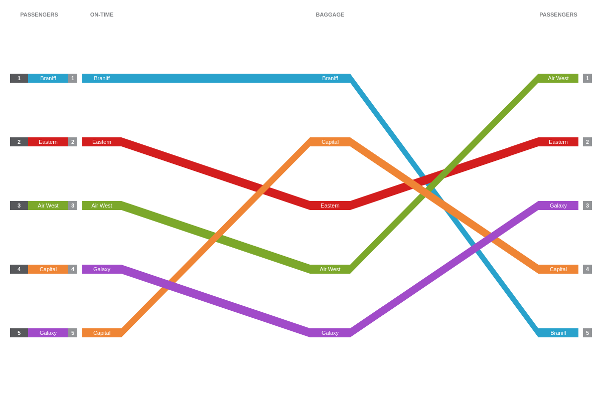
The sep-space attribute sets (forces) the size of the spacing between the overall section and the flow section. Enter a numeric value. Larger values will create a larger space.
{
  options: {
      'sep-space': 0
  }
}
Flat
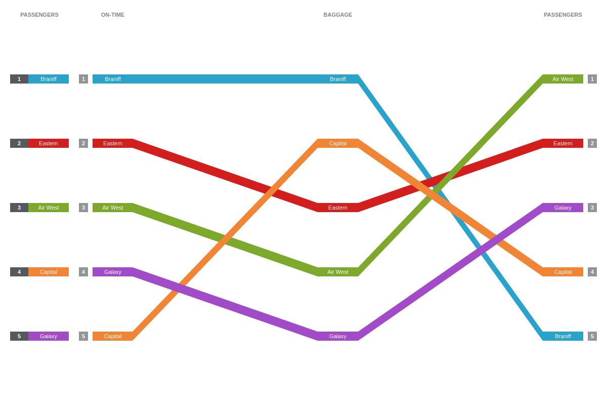
The flat attribute sets whether the main labels are active or not, allowing for one or more flow selection. Enter a value of true or false.
{
  options: {
    flat: true
  },
}
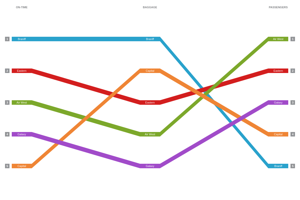
Global Ranking
The globalRanking attribute sets whether the global ranking are displayed (labels at leftmost side of the rankflow chart).
{
  options: {
    globalRanking: false
  },
}
Styling
JavaScript rankflow charts also include a number of global stylings that allow you to manipulate the appearance and behaviors of your rankflow chart. They can be implemented into your chart by placing them within the options object.
Style
The style attribute defines global styling for rankflow elements.
Note: See our options style JSON Configuration page for a full list of attributes.
Color Type
The color-type attribute sets the color algorithm used to color the items.
Random
Setting 'color-type': "random" lets the library choose random colors each time the chart renders. The chart does this by default so setting this value is optional.
{
  options: {
    'color-type': "random"
  }
}
Color
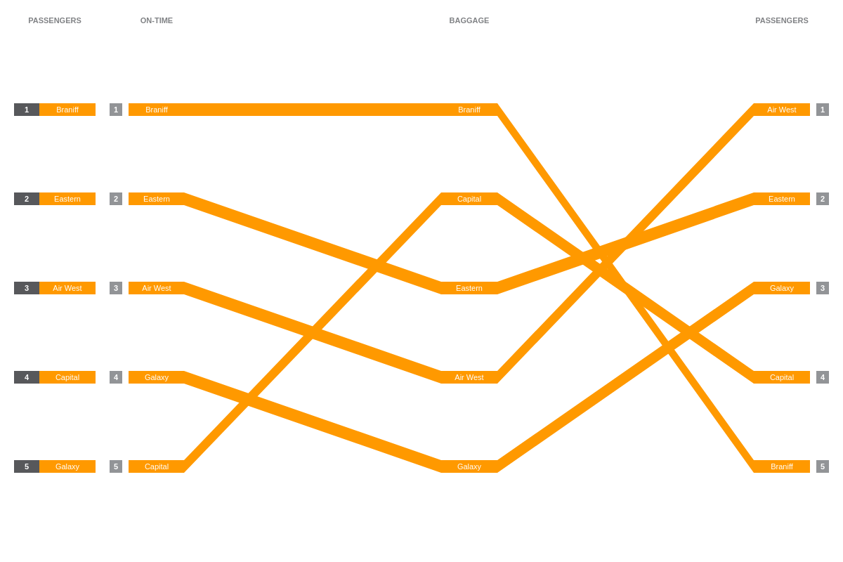
The color attribute sets the color of the flow sections when color-type is set to color. Provide a color, HEX, or RGB value.
{
  options: {
    'color-type': "color",
    color: "#f90"
  },
}
Palette
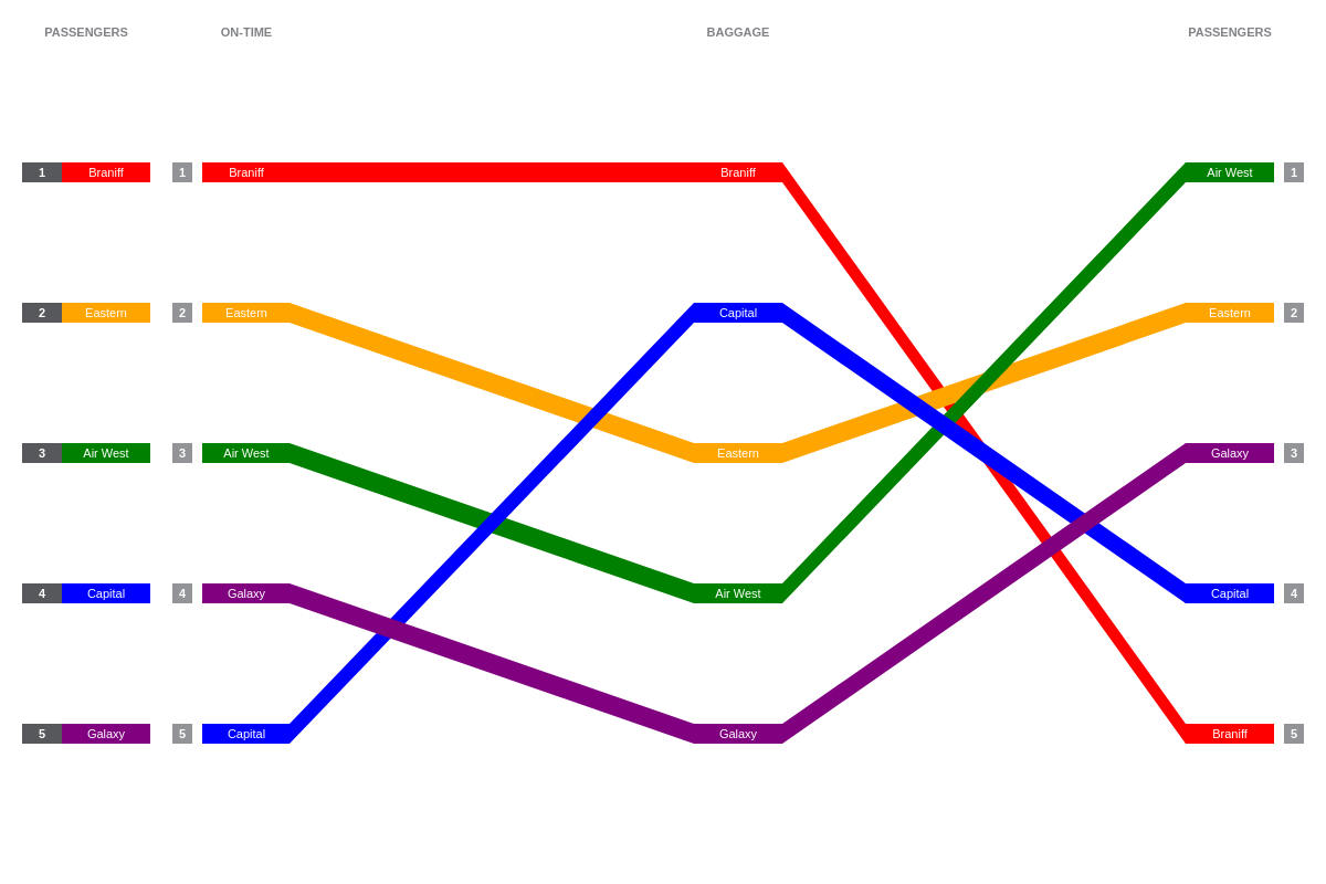
The palette attribute defines a custom palette used by the items when 'color-type is set to palette. Provide a string of comma separated color, HEX, or RGB values.
{
  options: {
    'color-type': "palette",
    palette: [ "red", "orange", "green", "blue", "purple" ]
  },
}
Flow
The flow attribute allows you to change the appearance of the individual flow sections.
{
  options: {
    style: {
      flow: {
        'border-color': "black",
        'border-width':2
      }
    }
  },
}

Item
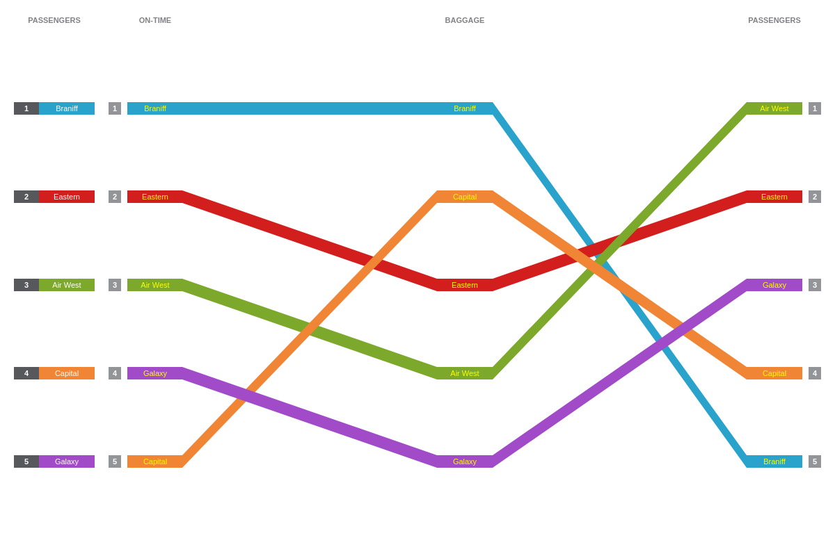
The item-flow and item-overall attributes allow you to change the appearance of the item names.
Item Flow
{
  options: {
    style: {
      'item-flow': {
        color: "yellow"
      }
    }
  },
}
Item Overall
{
  options: {
    style: {
      'item-overall': {
        color: "yellow"
      }
    }
  },
}

Label
The label-overall attribute allows you to change the appearance of the main label section header.
{
  options: {
    style: {
      'label-overall': {
        text: "My Custom Label"
      }
    }
  },
}

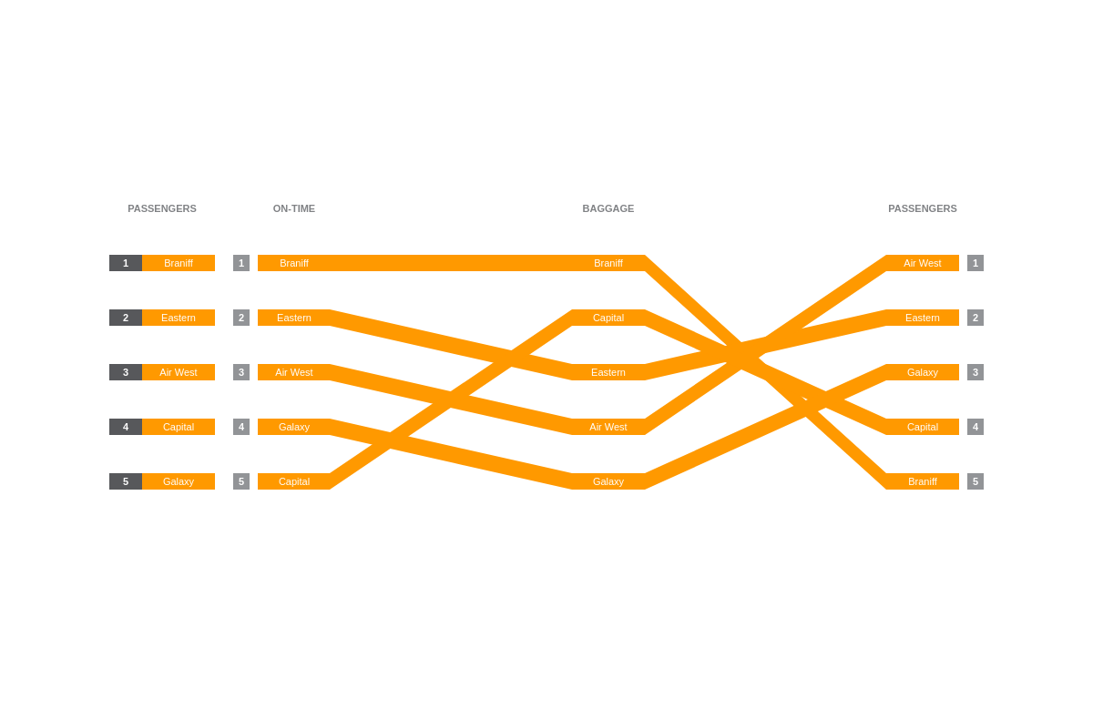
Margin
The margin attribute allows you to change the margins of the chart.
{
  options: {
    margin: '200px 100px',
  },
}
Rank
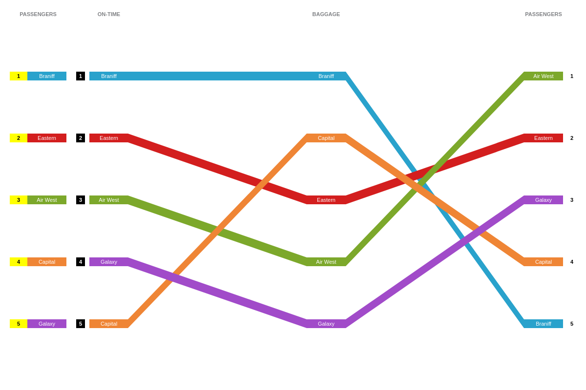
The rank-left, rank-right, and rank-overall attributes allow you to change the appearance of the rank markers on the left side of the chart, right side of the chart, and the main label section of the chart.
{
  options: {
    style: {
      'rank-overall': {
        'background-color': "yellow",
        color: "black"
      },
      'rank-left': {
        'background-color': "black"
      },
      'rank-right': {
        'background-color': "white",
        color: "black"
      }
    }
  },
}
Tooltips
The tooltip attribute allows you to change the appearance of the tooltip that appears upon hovering over a flow selection. Customize the tooltip's text with a text attribute and then provide your desired combination of text and tokens inside a string.
Note: Learn more about tooltips with our Tooltips Tutorial and tooltip JSON Configuration page.
{
  options: {
    style: {
      tooltip: {
        text: "%text: #%rank for %scale-value"
      }
    }
  },
}
